← All work04 / 05Wine · Rebrand at scale · A juice brand
Fanagoria
35 million bottles a year, finally on a strategy.
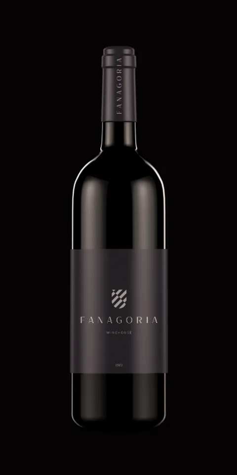
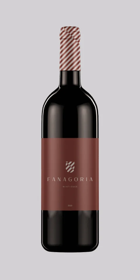
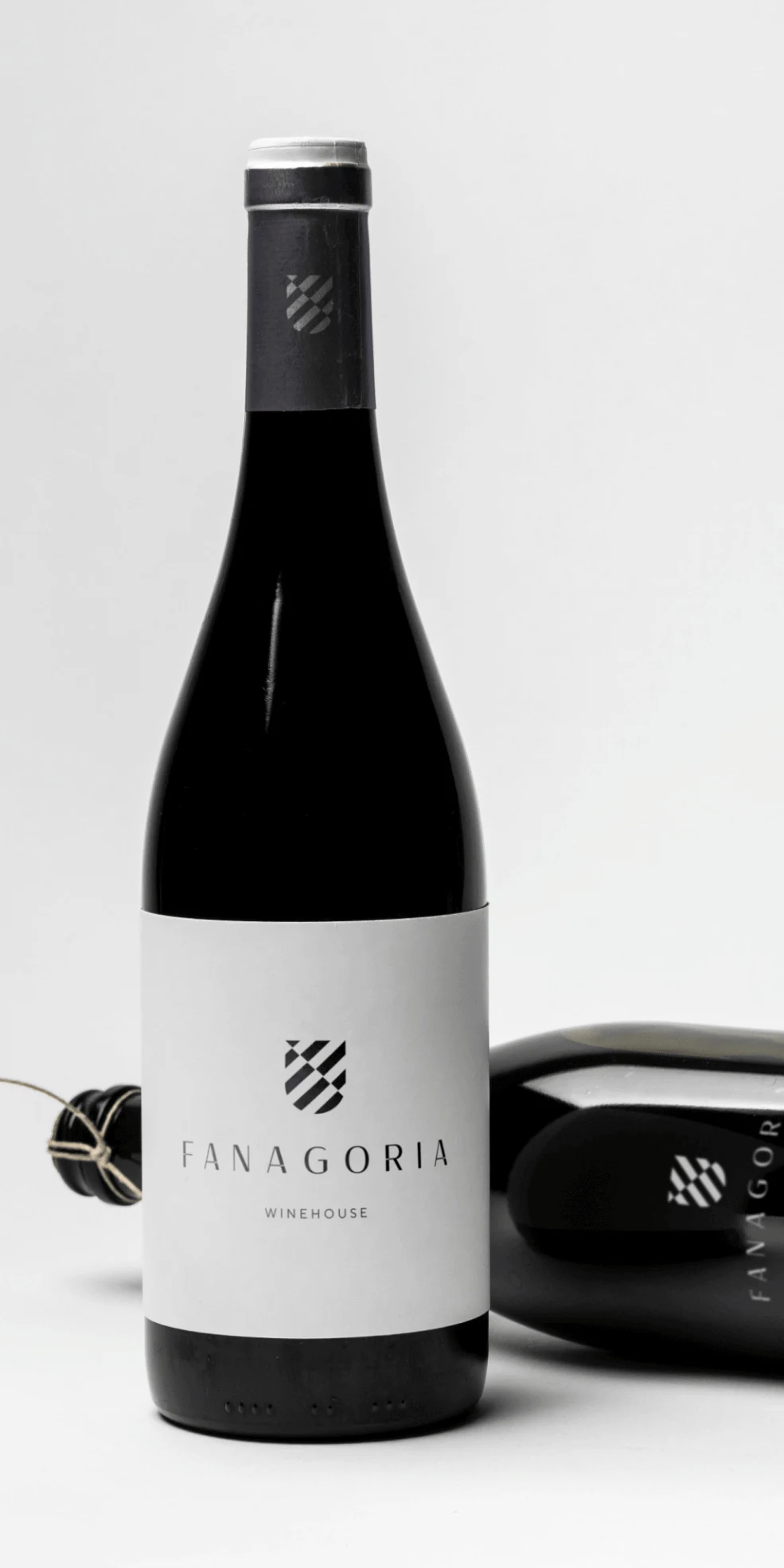
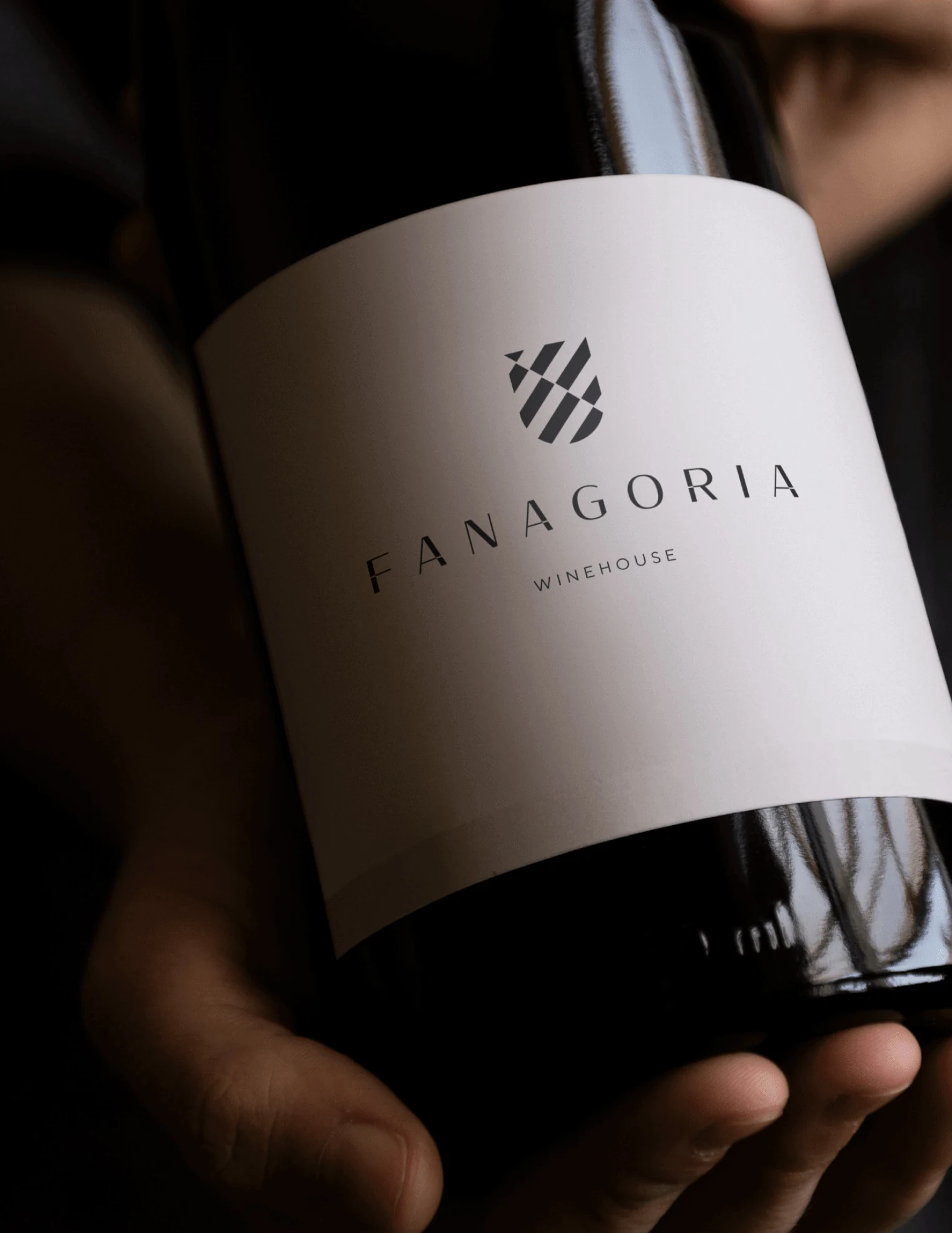
bottles a year, and every previous rebrand had failed to take.Fanagoria, 2019 – 2020
Before · fanagoria.ru, 2018–2019
A crest with two mermaids. A different look on every line.

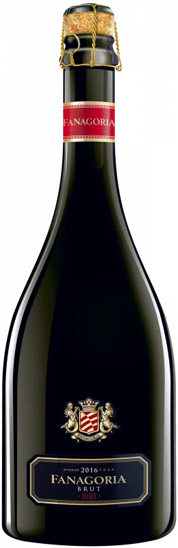
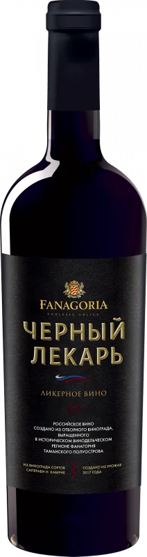
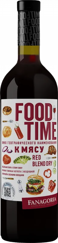
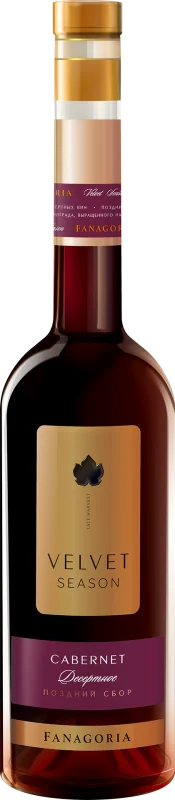
Crest and bottles as shown on fanagoria.ru in December 2018 and April 2019. Archived copy: Wayback Machine
Earlier rebrands changed the label and nothing underneath. I reversed the order.
- Research
Qualitative research across categories and audiences, before anyone touched a label.
- Architecture
Marketing strategy and product architecture across the portfolio, with pricing and retail behind it.
- Identity
The new look came last, so this time it had something to stand on.
After

A new brand
Juice from the wine grapes.
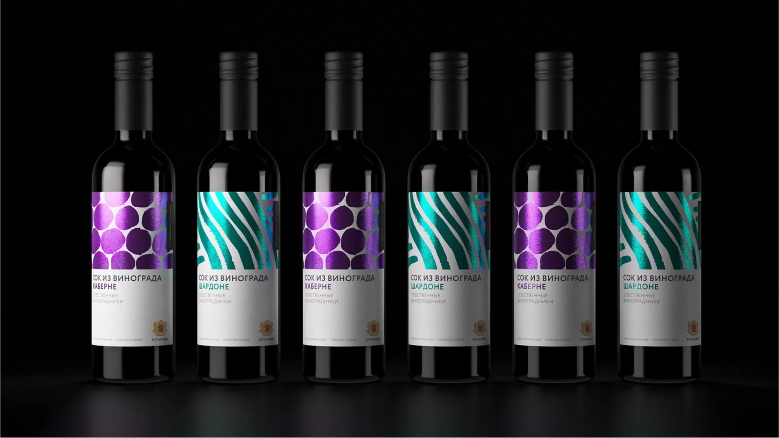
Single-variety juice from Cabernet Sauvignon and Chardonnay, picked by hand on Fanagoria’s own vineyards in Taman and bottled like wine: half a kilo of grapes in every 0.375 l bottle. Fanagoria made juice in Soviet times and supplied the 1980 Moscow Olympics. The new brand brought that back.
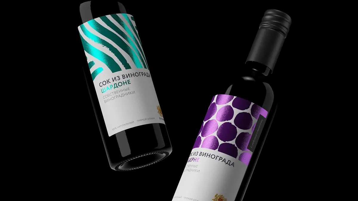
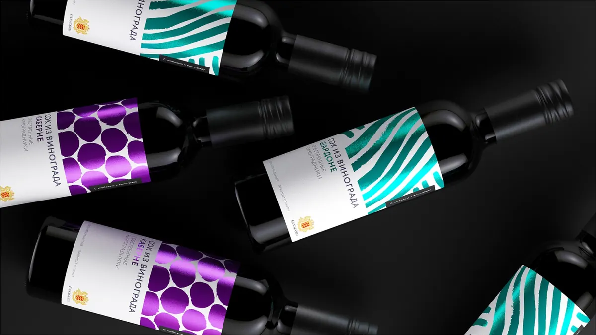
Packaging design and the slogan “With love for the grape”: LINII branding agency. Images: linii.ru
The case in three lines
The problem
One of Europe’s largest wine producers by volume, where every previous rebrand had failed to take.
Why they failed
Each one treated the brand as visual style. Nobody had done research, brand architecture or product strategy, so the new look had nothing to hold on to.
The move
Research first, then marketing strategy and product architecture, identity last. Plus pricing, retail redesign, a PR function from scratch and a new brand of grape juice.
What I did here, you can order
Next case
Gazprom Neft